
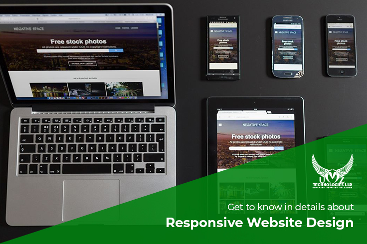
Responsive website design – this is a term that has been in the market for a long time now. Creating websites that can easily display the contents properly on the various devices as per the screen size is commonly the responsive website design. This means when your website is responsive whether it is mobile or desktop, users can easily check the websites. And You must look for the best responsive website design company to acquire the best outcome.
Internet is something that started globalization throughout the globe and which has also resulted in the growth of smartphones. Moreover, with so many brands coming up with a new and affordable smartphone, mobile internet has taken its peak. With more smartphone users available in the market, responsive web designs have become inevitable for businesses.
You must look for the best responsive website design company to acquire the best outcome.
What do you mean by responsive Web design?
Despite the number of definitions available in the market about responsive website designs on the internet, but let us have a look at the clear-cut definition of Responsive Web Designing.

“ Responsive Website Design is the approach which aims to develop websites that can easily adjust to the different types of devices – whether it is a small screen device or tablets or laptops.”
When did Responsive Website Design come into existence?
The answer to this would require you to go back to the early days of mobile internet. Back then, it did not have such major popularity, and most websites were served through the Wireless Application Protocol technology. Besides, browsers used on tablets and mobile phones are limited to standard compatibility, bandwidth, and CSS. Therefore, there was always a need for knowledge on techniques that can easily adapt to different layouts and devices.
Cameron Adams was the first one to have the need for such techniques in 2004 however, “responsive Web Design” is a term which was invented in 2010 by Ethane Marcotte. The complete practices and theory were explained in his book known as responsive Web Design.
What are the Key Principles of a responsive Web design company?
The major difference which distinguishes the responsive web design from the several other web development approaches is focusing on integrating breakpoints in web design rather than targeting devices.
When you are looking forward to developing responsive web design, there is always a need for adhering to the principles of the techniques. These are as follows:
Making use of the fluid grid system
Mobile-first viewpoint
Targeting the vital contents
Making use of the fluid grid system:
The fluid grid system is the consistency and order which comprises columns and rows in the responsive web design. It is the organizational presentation of framework that helps to create an order where information requires to get presented on site. Such a framework makes the entire thing much easier for visitors to choose information at their convenience along with getting whatever they are looking for.
You have a website with 3 columns in the desktop version when it comes to the mobile, the column gets narrowers. Therefore it will be great to offer the column in a stacked format over the mobile screen which will need users to scroll to check the contents of the website.
Have a look at the example of a fluid grid system in a responsive website:
When it is about tablet and mobile view, Global projects and Quick Links are placed just beside each other while the mobile screen is taking the width of the screen. Quick links and Global projects are placed below and hence can be accessed just by scrolling.
Mobile First Viewpoint:
Do you have an idea that websites mostly acquire 25% of their traffic from mobile while the rest 75% from desktop? However, the count keeps on changing with days. Even then responsive web design is taking its role part every day.
Even when the logic is the same in the website design but when you start designing as per the desktop configuration, most designers end up using functionalities and features in websites. When it comes to mobile websites, these will be unnecessary for smartphone users.
With the mobile-first viewpoint, we will only load the care necessities on the smaller platforms to a better viewing experience. This can also help to avoid lagging.
Targeting the vital contents:
You will need to prioritize relevant fields and information like the important content for both site owners and visitors. This is a crucial part of a strategic responsive design. There is always a need for taking care of designs and contents similarly when you are choosing responsive techniques. This plays a huge role in developing a searchable website over renowned search engines.
If you want to have a look at an example of responsive web design, you can check Barack Obama’s website.

As soon as your narrow the website, the “Donate” button present on the website comes at the center. Besides, “create Account and Login buttons while ZIP and Email buttons strictures leftover points. Even when the elements in the websites move, the images remain unaffected.
What are the basics of responsive web design and a responsive website design company?
Considering the set of tools and techniques, such web designs strive to rearrange the information that is being displayed as per the device’s capabilities. The prime way of this technique is to respond, this again means to procure information regarding devices.
The basics include:
Use simple layouts
media queries
flexible grids
Bottom Line:
When it is a responsive website design company, you should always get in touch with the best hands. Since there are a lot of things that you have to take care of while creating a responsive website.
Make sure you get in touch with the best responsive website design company as only a reliable and trained expert will be able to successfully design the website.